Disclosure: Gewerkton is built by our publisher — we build it ourselves and write down what we learn.

Get the latest gadgets delivered free — and shop member deals
- Fast, free delivery on millions of items
- Access to Prime Big Deal Days deals on October 6–7
- Prime Video, Amazon Music and more included
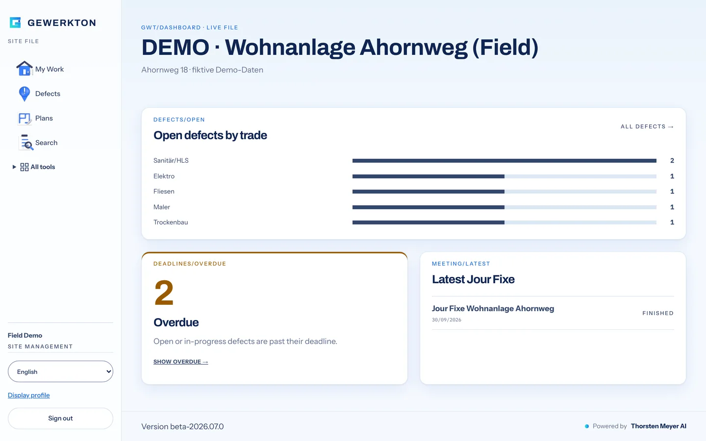
Until this week, Gewerkton was red. Every button in its phone app was red, and so was the icon set on its website. Since 3 October 2026 the construction-site documentation tool looks different. The website gewerkton.com, the web app, the Studio and the app for iPhone and Android now share one look, called HORIZON: a light sky-coloured background, navy type, cobalt surfaces and white cards with soft shadows. What has not changed is the status. Gewerkton is still in beta, and general availability is planned for 2027.
What Gewerkton does
Construction sites run on spoken words. Instructions are given in site meetings, problems are dictated into a phone, and photos pile up on work devices. Gewerkton is built to turn that material into defects, daywork reports and evidence that can be traced back to the original recording or photo, in whatever language the crew speaks. The website sums up the idea in one line: “On site, only what’s proven counts.”
Gewerkton is built by Thorsten Meyer, who directs a fleet of AI coding agents (Codex and Claude). Two rules frame the product. Nothing becomes binding without approval by the site manager, and transcription runs without external speech services, with no AI training on customer data. Gewerkton is organised into five lines that share one evidence chain: Field for capture on site, Studio for plans and models in the browser, Cloud for operations and region, Archive for evidence after a project ends, and Operations for the finished building after handover.
Red becomes a signal again
The most visible change is colour. In the web app, red is no longer decoration. It is reserved for signals, such as an overdue deadline or deleting something. That matters more on a construction site than it might in a consumer app. When an entire interface is red, an overdue deadline does not stand out. When red is rare, it does.
The redesign also ran into a classic problem: a colour that looks right can still fail people who need to read it. The cobalt first chosen for HORIZON did not reach a contrast ratio of 4.5:1 against the light background, the threshold Gewerkton checks against under WCAG 2.1 at level AA. So the shade was darkened slightly. Turquoise is kept for gradients and decoration and is never used for text on a light background. The typefaces changed too, to Archivo, Instrument Sans, Fraunces and IBM Plex Mono.
The web app now comes in light and dark modes. Before release it was checked in 200 views, in English, German, Japanese and Hindi, at widths of 390, 834 and 1440 pixels, which covers phone, tablet and desktop. No text ran off the edge and the browser console showed no errors. The phone app stays light for now, with a mobile dark mode planned as a later step. The web app and the Studio went live in the new look on the evening of 2 October, the help videos on 3 October.
New icons, and a mistake that only showed in the dark
All 26 interface icons were re-rendered in cobalt and navy. The first version did not work. In dark mode the icons sat on white tiles, and those tiles covered the labels next to them. No test flagged it. It was spotted by looking at the finished interface, and the fix went out the same evening: white inside the icons is now transparent, and dark mode gets its own variant of the set.
One website, forty languages, films for five regions
gewerkton.com is built in 40 languages, and the build produces 529 pages. New is a region selector with five choices: Europe, East Asia, Southeast Asia, South Asia, and the Americas and other regions. Every film slot on the site switches with that choice, so a visitor who picks East Asia gets the East Asian version of each scene. Where a scene has no regional version yet, the page falls back to the European one.
The films are AI-generated, and every file carries a marker saying so. The screens shown inside those scenes are a different matter. The website puts it plainly: “Real screens from the app, filled with a fictional demo project. The scenes around them are AI-generated; what is on the screen is real.” The pages for Studio, Cloud, Archive and Operations each got their own opening section with real screens as well, in German and in English.
After upload, the live site was run through a browser again at three widths and in all five regions. Nothing overflowed and no errors came up.

The app on iPhone and Android
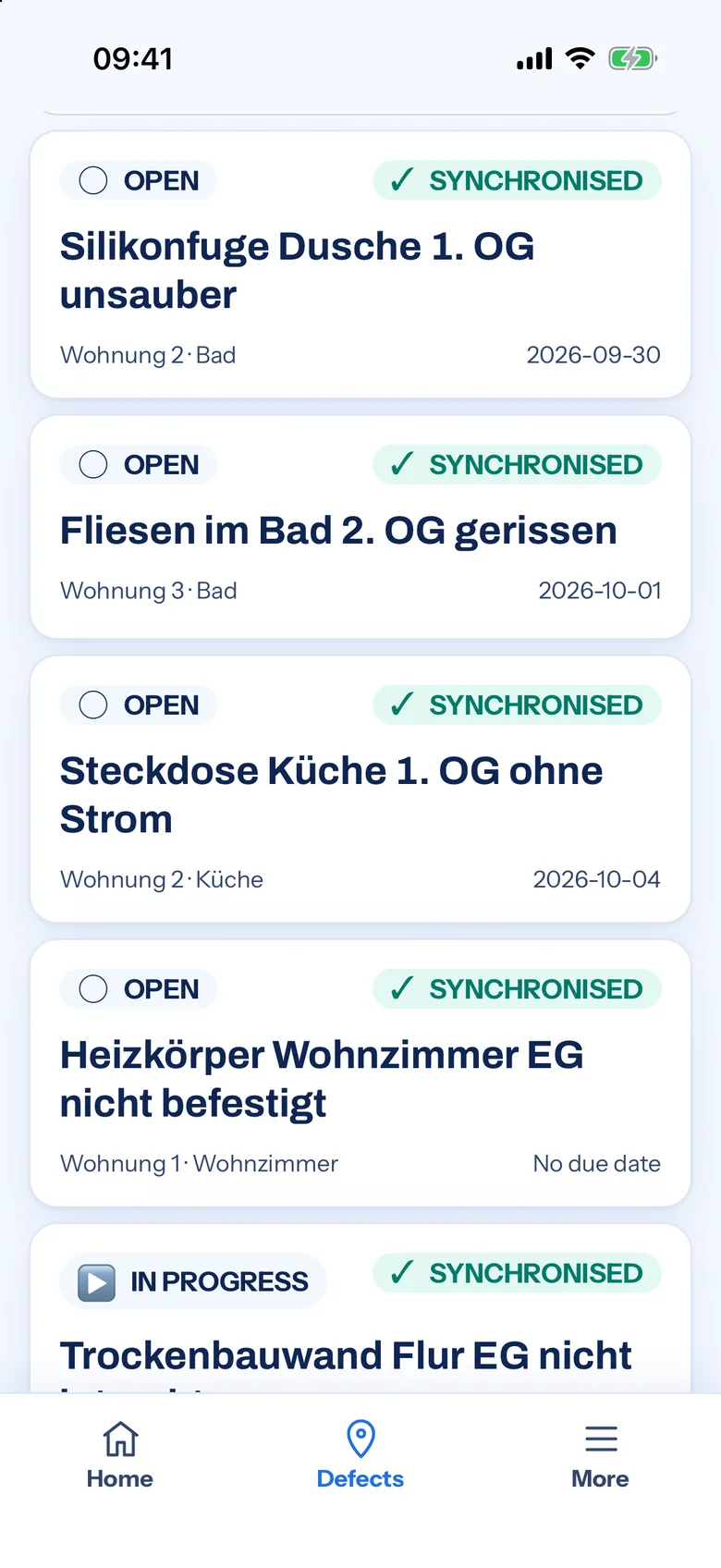
The site app reached version 0.5.0 with the new look. On iPhone it is in internal testing through Apple’s TestFlight, and the beta review with Apple has been submitted. The Android build was tested on a Pixel 10a on 3 October: creating a defect with and without a connection, taking a before photo, recording voice, and syncing once the device was back online.
The new look passed that test, and the app did not crash. It is not finished, though. The test report lists five major findings that go into a fix round for version 0.5.1. One of them was caused by the redesign itself. On the camera screen, the buttons now break in the middle of a word, because the new buttons use larger type and more padding than the old ones. The German word for cancel ends up split across two lines.
What beta means here
Gewerkton calls 2026 its beta year. Field, Studio and Cloud are built. Anyone who looks inside sees real working state, and not every feature is finished. The website lists Studio and Cloud as public beta, while Field is in beta ahead of the public beta. General availability is planned for 2027, and the website itself calls that a plan and not a promise.
Archive and Operations are built and in beta, but not yet in use at a customer. The same holds for the other lines: none of the five has been in use at a customer yet. A new look does not change that. It makes the interface calmer, the signals clearer and the website better suited to teams in five regions. Whether the product holds up on real sites, with real deadlines and real handovers, is still to be shown.
Teams that want to try Gewerkton early can request access and join the waitlist. How plans and models come together in the browser is described on the Studio page, which already wears the new look.
Evergreen bestsellers Picks
bestsellers
As an affiliate, we earn on qualifying purchases.