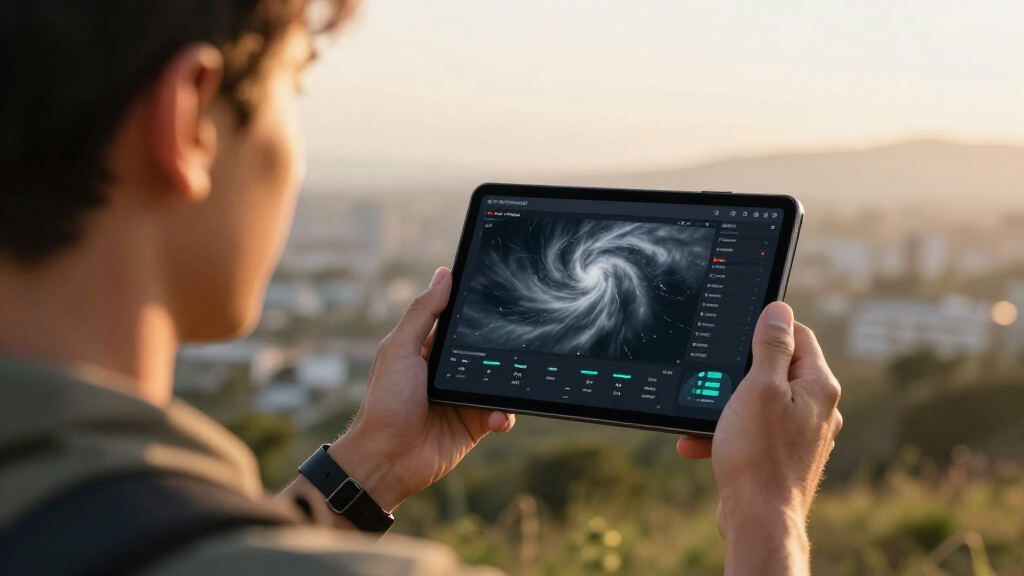

📊 Full opportunity report: How The Vortex Field Unit Archive Renders Signature Storm Data With Zero Image Assets on ThorstenMeyerAI.com — validation score, market gap, and execution plan.

Get the latest gadgets delivered free with Prime
- Fast, free delivery on millions of items
- Prime Video, Amazon Music and more included
- Member-only deals all year
TL;DR
The Vortex Field Unit Archive has launched a novel digital storm visualization that displays supercell data without using static images. It employs synchronized procedural graphics driven by scroll interactions, highlighting data accuracy and disciplined visualization, as explained in the original analysis. This development offers a new approach to storm data presentation, with implications for weather research and education.
The Vortex Field Unit Archive has introduced a new digital visualization technique that renders signature storm data entirely through procedural graphics with zero external images. This development allows viewers to experience a supercell’s lifecycle via synchronized, scroll-driven layers, emphasizing data integrity and disciplined visualization, without relying on static imagery or external media sources.
The Vortex Field Unit — Plains Intercept Archive is an AI-crafted exhibition that visualizes storm chases using a fully code-based approach. It employs HTML, CSS, and JavaScript to generate layered visualizations, including cloud movements, radar reflectivity, and storm features, all synchronized with user scroll input. The system demonstrates how complex weather phenomena can be depicted through procedural graphics, focusing on data agreement and disciplined visual storytelling.
According to the creators, the visualization captures the evolution of a supercell, with key features such as funnel clouds and radar hook echoes appearing precisely at designated scroll points. The interface uses a restrained color palette—storm green, radar green, warning amber—and custom fonts to evoke a stormy atmosphere while maintaining clarity and responsiveness across devices. All visual elements are generated dynamically, avoiding static images or external requests, demonstrating a self-contained, code-driven approach to storm visualization.
Thorsten Meyer, the project’s lead, stated that the goal was to create an immersive, data-accurate experience that emphasizes the procedural nature of storm development, as detailed in the original analysis. The visualizations are designed to be both scientifically disciplined and artistically engaging, with layered animations that develop in harmony as the user scrolls.
How the Vortex Field Unit Archive Renders Signature Storm Data With Zero Image Assets
A self-contained digital exhibition turns storm structure into synchronized, scroll-driven layers—using code to reveal cloud development, radar signatures, and lifecycle transitions without static imagery.
Storm structure becomes a coordinated visual system
The archive separates atmospheric features into procedural layers. Each layer responds to the same narrative position, allowing the visual story to develop as one synchronized event.
Cloud architecture
Layered shapes, gradients, opacity, and motion construct the evolving supercell without a photographed sky or pre-rendered backdrop.
Reflectivity cues
Programmatic fields visualize storm intensity and signature geometry, including the emergence of a hook-like radar form.
Scroll choreography
User movement controls when visual layers appear, strengthen, converge, and dissipate across the supercell lifecycle.
One input coordinates every visible signal
Scroll position acts as the shared clock. Atmospheric form, radar interpretation, and annotation advance together so the presentation maintains narrative agreement.
Scroll input
The viewer establishes a precise position within the storm narrative.
Progress state
The interface translates position into a normalized lifecycle value.
Cloud layer
Procedural forms build depth, rotation, lowering, and dissipation.
Radar layer
Reflectivity patterns develop alongside the visible storm structure.
Shared frame
Labels and visual cues arrive at their designated moments.
Illustrative layer progression
Procedural graphics change what can be inspected
The approach favors transparent construction and synchronized storytelling. Its scientific accuracy, forecasting value, and live-data performance still require independent validation.
| Capability | Static media | Vortex procedural model | Current status |
|---|---|---|---|
| Lifecycle control | Fixed sequence or playback | ✓Scroll-linked progression | Demonstrated |
| External image dependency | Usually required | 0No static image assets | Core design constraint |
| Layer synchronization | Embedded in finished media | ✓Shared procedural state | Demonstrated |
| Live forecasting use | Established radar workflows exist | ~Not yet validated | Future research |
| Scientific verification | Depends on source and method | ~Peer review still needed | Open question |
A new interface for severe-weather storytelling
Code-native visualization can make complex storm development interactive, scalable, and easier to adapt. The strongest near-term opportunities sit in education, research communication, and transparent digital exhibits.
Researchers
Layered visual states can expose how separate storm signals relate across a common timeline.
Educators
Interactive progression can make storm formation and signature development easier to explain.
Public communication
Responsive, self-contained experiences can broaden access without relying on heavy media libraries.
Emergency management
The format may support clearer risk narratives, but operational use requires rigorous validation.
What is proven—and what comes next?
The archive demonstrates a compelling presentation method. The next phase must establish how closely its procedural output corresponds to measured storms and operational radar products.
How does it work without images?
HTML, CSS, JavaScript, and vector geometry generate the visual layers dynamically, while scroll position coordinates their development.
Can it forecast storms?
Not yet. It is currently a demonstration and storytelling system; real-time forecasting use remains unvalidated.
What is the main advantage?
The result is self-contained, responsive, transparent in construction, and independent of static media assets.
Validation roadmap
- Compare procedural outputs with observed storm data and traditional radar imagery.
- Test the visual grammar across multiple storm types and lifecycle patterns.
- Explore live-data integration without sacrificing performance or traceability.
- Develop educational modules and invite scientific critique and peer review.
Implications for Weather Data Visualization
This development introduces a new paradigm in storm data visualization, emphasizing procedural graphics over static images. It demonstrates that complex weather phenomena can be accurately depicted through code, fostering transparency and data integrity. For researchers, educators, and meteorologists, this approach offers an interactive, scalable method to analyze storm structures and evolution in a disciplined manner, potentially improving understanding and communication of severe weather events.
Furthermore, the archive’s methodology aligns with efforts to create self-contained, media-free visualizations, reducing reliance on external assets and enhancing accessibility. It may influence future digital storm visualizations, making them more dynamic, precise, and accessible for various audiences, including emergency management and public education.
As an affiliate, we earn on qualifying purchases.
Background on AI-Driven Storm Visualization Techniques
The Vortex Field Unit Archive is part of a broader movement toward AI and procedural graphics in scientific visualization. Previous efforts relied heavily on static imagery or external media, limiting interactivity and transparency. This project, designed by an AI-driven art and engineering pipeline, showcases how fully code-based visualizations can accurately represent storm lifecycle stages, from cloud formation to dissipation.
Similar approaches have been explored in experimental weather visualization, but the Vortex archive’s emphasis on zero external requests and self-generated graphics marks a significant advancement. It builds on recent trends in digital storytelling that prioritize data integrity, interactivity, and artistic clarity, reflecting ongoing innovations in weather simulation and education tools.
Since its inception, the project has undergone multiple critique phases, refining visual cues and ensuring data agreement. It aligns with recent research emphasizing procedural graphics as a means to improve scientific communication and engagement.
“This visualization demonstrates how storm data can be rendered purely through code, emphasizing transparency and data fidelity.”
— an anonymous researcher
As an affiliate, we earn on qualifying purchases.
Unconfirmed Aspects of Data Accuracy and Interactivity
While the visualization’s procedural approach is promising, it is not yet clear how accurately it replicates real-time storm data or how it compares to traditional methods in scientific validation. The extent of its interactivity and potential for real-world forecasting remains to be tested and validated in scientific settings.
Additionally, details about how the system handles different storm types or integrates live data inputs are still emerging, and the project’s scalability for broader meteorological use is uncertain at this stage.
procedural graphics programming books
As an affiliate, we earn on qualifying purchases.
As an affiliate, we earn on qualifying purchases.
Next Steps for Validation and Expansion
The project team plans to conduct validation studies comparing the visualization outputs with real storm data and traditional radar imagery. Future updates may include integrating live data feeds and expanding the system to visualize other storm types or atmospheric phenomena. Additionally, the team aims to develop educational tools and interactive modules based on this procedural framework to enhance public understanding of severe weather processes.
Further critique and peer review will determine the visualization’s scientific robustness and usability in operational contexts.
interactive weather visualization devices
As an affiliate, we earn on qualifying purchases.
As an affiliate, we earn on qualifying purchases.
Key Questions
How does the Vortex Field Unit Archive render storm data without images?
It uses procedural graphics generated entirely through JavaScript, CSS, and SVG, synchronized with user scroll to depict storm features dynamically.
Can this visualization be used for real-time storm forecasting?
Currently, it is a demonstration tool focusing on data agreement and visual storytelling. Its use in real-time forecasting remains to be validated through further testing and integration with live data feeds.
What advantages does this approach offer over traditional storm visualization?
It provides a fully self-contained, media-free, interactive experience that emphasizes data transparency, procedural accuracy, and artistic clarity, reducing reliance on static images and external assets.
Is this visualization accessible across different devices?
Yes, it is designed to be responsive and perform flawlessly at various screen widths, from mobile to desktop, with optimized animations and layout.
Source: ThorstenMeyerAI.com
Halloween Picks
halloween
As an affiliate, we earn on qualifying purchases.